Semiotics Assignment:
Well this week was along one to say the least! With everyone rushing off to finish there College Promotional Video’s for Digital media and the Semiotics collage for Visual Language!
S E M I O T I C S _ C O L L A G E :
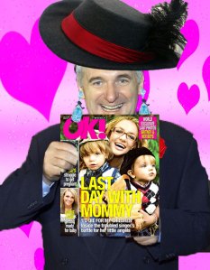
For my semiotics collage the celebrity i choose to portray in 3 different ideologies was Bertie Ahern. I picked Bertie Ahern because i thought it would be funny to pick a politician as there always taken so seriously and who better than Bertie Ahern! Also i thought it would be quite amusing to put a final feminine touch to him as he wheres enough makeup as it is!
I A M F E M I N I N E
The first thing i did here was i put a pink background with love hearts…. how feminine can you get!?
Next i put a woman’s hat on him with a feather to put an even more feminine look to the hat, after this i put some ear rings on him. Next i made it look like Bertie was holding a copy of the Ok Magazine’. I picked Ok magazine because its mainly a magazine associated with women. No offence to anyone( lads ) that read the magazine of course.
I A M P O P U L A R
The first thing i did for this ideology was i put a background of a Grammy Awards’ and next i simply put Bertie holding a Grammy Award.
This was my first time using PhotoShop; So some of my collage’s my appear pretty basic but i now feel i have a better understanding of it after finishing off this assignment 🙂
I A M E V I L
For my final collage the first thing i did was i put the background of the skull and fire to make it appear like he was in hell; cliche i know but oh well …
Basically as you can see i made Bertie appear like he was a Pirate; I added a pirate’s hat and an eye patch to his head. Also with the additional help of the burn tool in photoshop I made it appear like his face was burnt to complete the look to his face.
Next i added the sword and the hook hand to both of his hands.. and finally put a parrot on his right shoulder to complete the Cliche Pirate look hahaha
__________________________________________________
Design Principals:
In are first few lectures in Visual Language we looked at such elements as
- SHAPE/FORM
- SPACE
- POINT
- LINE
- TEXTURE
- PATTERN
- COLOUR
These elements in many ways could be considered Elements of Design as in the starting point in creating your Composition.
The Design Principals on the other hand are what we do/how we use the elements of design to improve are overall Compostion.
1. The first Design Principal we looked at was Balance.
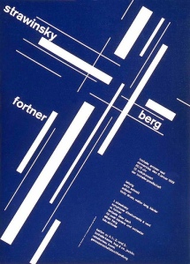
There are 2 forms of visual balance: Symmetrical Balance & Asymmertrical Balance.
Symmetrical Balance:
Is a mirror image balance; A Human face is considered to be the most Symmetrical thing as both sides are even.
Asymmertrical Balance:
These type of layouts dont mirror each other; An example of an asymmetrical layout would be placing Several types of objects on one side of a poster while having only 1 on the other side. Layouts like this can be very appealing to people as it makes us think.
2.The next principal we looked at was contrast
Contrast means simply difference with reference to design principals as having to much similarity can look bland and plain.
Contrast can create tension by placing opposite elements in relation to each other>
Contrast in:
- Compostion
- Size
- Shape
- & Colour
……..can make for a dynamic design.
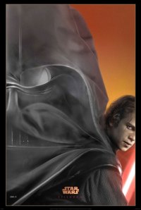
Heres another good example of contrast within colour for the sweeney todd Movie Poster!


